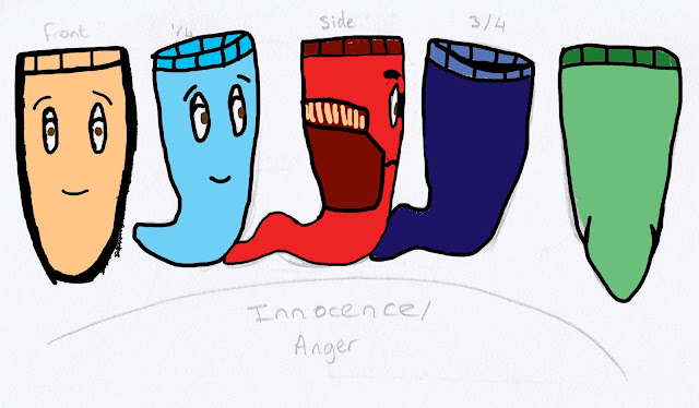
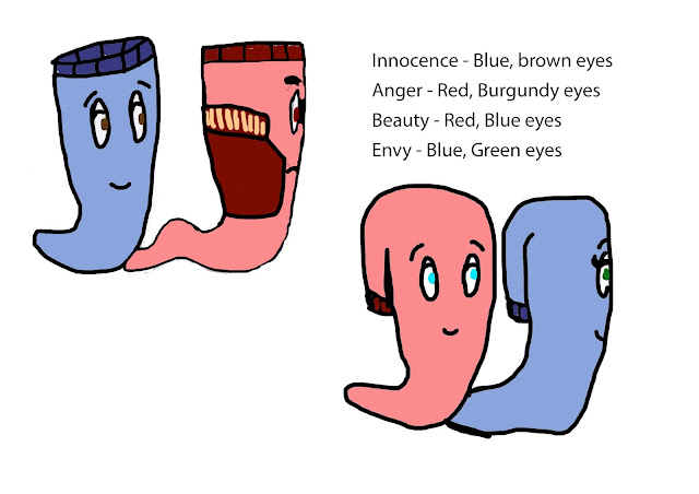
After the last design on the character shapes, I decided now to focus on colours for the characters which began by picking colours I thought looked appropriate to the characters overall personality, such as red for anger, etc. I then developed this even more to combine the two sets of socks' colours to create one unique colour that is essentially unisex. The red works perfectly between male and female and even made the "Anger" character look even more like a "Jock" from high school. The next step was to decide whether the blue fitted the male and female forms which in some ways it does but could do with being a slightly lighter shade of the same colour so the character stands out more.
Monday, 31 October 2016
Week 5 Character Colours and Patterns
After the last design on the character shapes, I decided now to focus on colours for the characters which began by picking colours I thought looked appropriate to the characters overall personality, such as red for anger, etc. I then developed this even more to combine the two sets of socks' colours to create one unique colour that is essentially unisex. The red works perfectly between male and female and even made the "Anger" character look even more like a "Jock" from high school. The next step was to decide whether the blue fitted the male and female forms which in some ways it does but could do with being a slightly lighter shade of the same colour so the character stands out more.
Week 4 Character Turnarounds
Following on from my designs, I decided to put together the character turnaround for both the female style characters and the male style characters (the only difference is the face). I purposely left the detail and use of colour out of this so that it is easier to focus on the shape of the character rather than the patterns/colours used. The character turnaround allows me to visualise the character from any angle and acts as a reference to when I draw the storyboard in detail in it's final form.
Week 4 Storyboard tiles
Using my designs and research, I began following the story and started to form the idea for my animation through a storyboard. I began the scene with the main character "Innocence" facing towards two other main characters "Anger" and "Beauty"; They are arguing and the noise is deafening. Innocence can't sleep. He looks up at "Envy", staring out at "Anger" in awe of his dominant and muscular physique. The next scene begins with "Innocence" and "Beauty" finally meeting and talking before being called over by "Anger". "Beauty" reluctantly begins walking back towards "Anger" before "Innocence" shouts. Suddenly the door bursts open and "innocence" is snatched up, "Beauty" screams before also being taken. The scene changes to the homeless shelter and then socks are given away to be worn as a pair, happily together. I believe this stands as a strong story for my animation and I feel like the message is clear. It is a long story so I will have to cut it down to the main section, more likely to be scene 2 than 1 or 3.
Thursday, 20 October 2016
Week 3 Character Designs 2
Next, I decided to focus on more specific parts to the character design, doing some sketches on movement and dialogue to get more of an idea as to the overall dynamic of the piece.
The movement took some consideration to come up with a design that worked with the sock shape. I managed to settle on the caterpillar/worm design which is explained in the diagram above; the tail moves in towards the body before pushing from the tail to move the body forward, then repeat.
The same design will work for all the characters as they all have the same/similar shape.
The dialogue section is a play on the idea of inanimate life within the bedroom, so saying they are from "1st drawer" as opposed to "1st floor" in an apartment.
Week 3 Character designs
Then after creating the collage images, I decided to develop the idea behind the character into more of a design aspect that would be simple to draw and obvious that it is still meant to be a sock. I decided on giving the characters more of a sense of exaggerated features such as, "Anger" is always angry at Innocence and Beauty for trying to be together (he's old fashioned), If Beauty is caught doing something she shouldnt be doing, Anger will hit her. "Envy" looks more at Anger that she does Innocence because he's strong. Beauty is sick of Anger but she's scared of him and Innocence wants to get Beauty away from Anger so that they can be together. I also came up with the idea of having "Busy" sock who would add some comedic value to the piece showing no interest in anyone, just passing on by on his way to work.
Week 3 Collage designs
After coming up with my idea for thew story, I began to look into characters and their shapes and materials, which I did through a collage of materials that I deemed to be appropriate for the character and I cut them out into shapes of socks with the two main characters being in the middle surrounded by these other socks and their pairs waiting for them in either corner, showing how they are trapped and cannot ever be together, or so it seems.
I feel this is a good way of visually displaying the first initial concept without having to delve into too much detail to get ahead of myself. The technique demonstrates the personality through the use of materials and their shape/style gives the audience a sense of understanding in a visual concept.
Thursday, 13 October 2016
Week 2 Written Treatments
Beauty emotion attachment
Forbidden opportunity success
Kindness compassion happiness
Generosity assistance guidance
Curiosity adventure thrill
A pair of socks, an odd match, hopelessly
in love. Forever separate, until given to someone else to be paired
together.
Two characters, matched separately, find
their way home to each other.
I feel that the Short Treatments carefully convey the overall message whilst allowing the audience to have some interpretation over it so that it can be more relatable to them. In my opinion, the strongest one is "Kindness, compassion, happiness" as this promotes a positive and a strong contribution towards a younger audience. The message would carry out subconsciously about doing a small act of kindness which can greatly affect someone else in a positive and "happy" way.
The weakest Short Treatment I feel is "Beauty, emotion, attachment" as this just focuses entirely on love without having much of an impact on society, it has no meaning or greater influence. It just relies on a happy "feel-good" story.
As for the Abstract Treatments, I feel the strongest one is "Two characters, matched separately, find their way home to each other" because it works hand in hand with the strongest Short Treatment as they act as two parallel lines; one carrying a message to the viewer and one carrying the story as a whole. It is generic, widely applicable and easy to elaborate upon in any scenario. For example, "Two socks, put with other socks, want to be together but they can't because they don't match, are eventually given away to a homeless person where they can finally be together even though they don't match." This idea would work perfectly as a subliminal message with a strong love story. The subliminal message being to give something makes a big difference to some people. A message would be put at the end of the film saying "Socks are the most needed but least donated article of clothing in homeless shelters" as this creates a big impact on society to get them to make a change.
Monday, 10 October 2016
Week 2 Contrasting Mood Board
Using the Primary mood board, I began with the colour palate and the use of faded and I went with the opposite mood/feeling by using bright and vivid colours to show off the contrast against the primary mood board. The bright and vivid colours promote happiness and freedom as well as joy which makes an interesting underlining to the overall theme. The next section is dirty feet; these are in contrast to the comfortable wool socks which makes the element of happiness even more interesting. Perhaps the character is happy with what the have? They live in poverty and they are happier walking in bare feet than wearing socks? Then there's the owl and the mermaid which I wanted to use to show isolation and loneliness so that the idea could be imagined in more ways than human emotion. After that there's a messy room and a dark rainy day looking outside which contrast against the neat and tidy warm feeling room which isn't as welcoming, it seems more repulsive. Then for the last bit we have the dark streets, which demonstrate the composition of a potential scene in the streets through rain in the cold.
Wednesday, 5 October 2016
Week 2 Primary Mood Board
Following on from Last week's post, I took the idea of the socks and collected some images to use in a mood board to visually demonstrate the theme/style of the narrative. I liked the idea of a Christmas theme to carry the heartfelt message in the subliminal sense to give away any spare or unused socks to the homeless because they get all sorts of other bits and pieces but one thing they lack the most is socks.
The idea is that two different socks want to be paired together but they keep being put with the same types but eventually one day the owner donates the socks to a homeless shelter and they are finally paired together as these are the only socks that the homeless person has/was given.
The overall mood will be a cold, less vibrant appeal to give the audience a sense of lacking; something that's not as good as it could be. This helps them empathise with the socks to make them want to be together.
Subscribe to:
Comments (Atom)


